2010年12月28日星期二

24 hOuRs In ShAnGhAi

Illustration for Oryx Magazine
Client: Qatar Airways
Theme: 24 Hours in Shanghai

http://www.fernandovt.com/

24 hours in Casablanca- Morocco

2010年12月20日星期一


korean  pop MV, using korean typography, very unique and interesting~visual effect is great
运用字体元素所做的mv

2010年12月16日星期四

Year2 project: Everything is connect


The project of mine which use the chinese traditional children's song about a strange story. the content could unlimited repeat and represents that everything is connect......the stick could move and built up randomly.

content of children's song:
......
gun shot tiger,
tiger ate kids,
kids geld rooster,
rooster pecked bee,
bee stung bald head,
bald head carried gun,
gun shot tiger,
......

...洋枪打老虎,老虎吃小孩,小孩抱公鸡,公鸡捉蜜蜂,蜜蜂叮瘌痢,瘌痢背洋枪...


2010年11月20日星期六

artless: About Japanese Essentials


From the number series for video

 company company WOW’s artbook, “1.”


Japanese artist Shun Kawakami create the typographic,there is a short interview from (www.pingmag.jp)


Q:Japanese culture plays a greater role in your overall work. Any specific reason for that?

A: I always keep the idea of presenting my works overseas in my mind, so I try to stress my originality based on the fact that I am Japanese. Then I use motifs that really interest me at the time, such as Ikebana, Bonsai, and calligraphy on top of that.


Q: How come? Is there any incident or story to it?
A: When I participated in an exhibition for +81 magazine in New York, I wanted to make something surprising for the locals, something that made me aware of the ideas that only the Japanese can come up with.In the past, I used to create works that were aiming at Western styles. However, once I had stepped out of the country, I noticed that there were so many doing the same sort of stuff and that made me realise that there is probably no need for me as a Japanese to do the same… So since then, I started studying about Japan and began to look at Japanese ink and wash paintings with particular attention to spacing and compositions. I’d always liked Japanese paintings, but I became even more fond of it since.

2010年11月18日星期四

REA IRVIN


Rea Irvin, Life, August 10, 1922. The Japanese American Number


CeramiX design collection


A series of ceramic objects reflecting on the historical production of Chinese and European porcelain and its centuries of cross-fertilisation between Western and Eastern aesthetics. CeramiX Art Collection & CeramiX Design Collection are the results of a lengthy research that has identified the key elements characterising both cultures placing them together in new unique forms.
(copy fromwww.ctrlzak.com)


    这几款来自于CTRLZAK设计工作室的陶瓷艺术品就是中国与西方艺术风格结合的代表,陶瓷艺术品包括碗、盘子、花瓶等,全部运用欧式与中式或古典与现代的拼接方式。从形体上看,陶瓷艺术品中式部分与欧式部分并没有很好的融合起来,它们之间的相互碰撞“产生一条裂缝”,而从设计思想考虑,设计师在表达他们对于中西方文化差异的认知,它们的碰撞也能融合成一个完整的形体和纯粹的艺术魅力。
(转载于 云*空间)

2010年11月17日星期三

the case about cross-cultural design


Corporate identity for the Hongkong Hilton, 1962. The double H logo resembles Chinese lattice work as well as one of the I Ching hexagram symbols.
(copy from 'Cross-cultural design',p49)
香港希尔顿酒店logo,双H象征中国古典窗架结构,而字母I又与八卦有关。


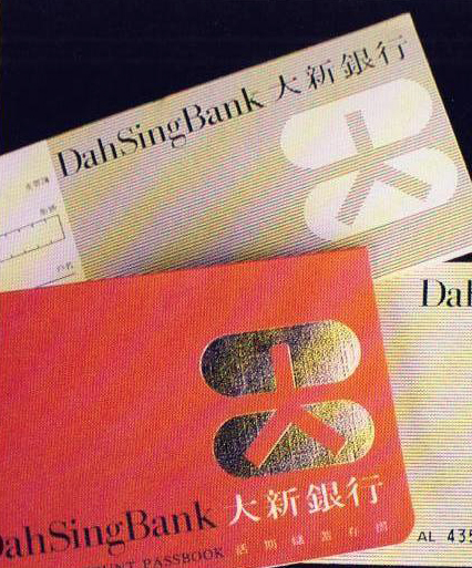
Corporate identity for a bank, 1980. The symbol is derived from the beads of an abacus, which contain in negative the character dah, meaning"big".
(copy from 'Cross-cultural design',p49)

dah银行 logo,其灵感来源与算盘。logo负形部分为中文字体“大”。